Drink of the Night: Too many to count, but Sam Adams' Blackberry Witbier was #winning
Nail of the Night: OPI DS Coronation
Here at Polish & Tonic, 'Last Night's Nails' has become my weekly round-up of what I was wearing - and drinking - over the weekend. Notice that this post is coming very late on a Monday night - it was that awesome of a weekend! I hope you all enjoyed the Memorial Day holiday. I had a friend visiting from San Francisco, and my LA crew did it big with several parties and BBQs all weekend. Thank goodness I took tomorrow off to recover!
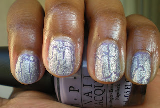
Since this weekend was more about daytime drinking and fun in the sun, I really wanted a manicure that really shined in bright daylight. I was wearing a dark gray dress for the main party Saturday , and decided to pick a color from the OPI Designer Series - Coronation. DS Coronation is a bright silver polish with crushed glass to give it a 'diamond-dust' glimmer. This particular polish was great at capturing light and reflecting a rainbow of color. This is 3 coats of DS Coronation (no topcoat):
Now, I know I normally do not discuss pedicures here (and would never force you guys to see pics of my feet! ewww), but I tried out a new pedicure this weekend that I absolutely loved and have to share. It's Too Too Hot from the essie Braziliant Summer 2011 collection. Too Too Hot is a bright red-orange creme that screams summer to me. I normally do not like to wear oranges as they tend to have a yellow undertone that does not match well with my coloring, but since TTH has a red undertone to it, I thought it was perfect. No piggies, I promise, so I swatched the polish on my hands for you to see; this is 3 coats of TTH (no topcoat) and apologies for the mangled pointer finger:
I am in LOVE with this color! I am not normally a hoarder - I prefer to have a lot of different colors/options as opposed to stocking up on bottles I love - but this may just be the first polish I for which I need a backup. That's how great I think it is!
essie Too Too Hot is currently available as a part of the essie summer 2011 collection Braziliant. You can find it at large retailers such at Target, CVS, and Walmart. OPI DS Coronation has been discontinued, but there are still a few bottles here and there. Put on you walking shoes and take some time to hunt it out at your local beauty salon or beauty supply store!
What do you think? Have you picked up any polishes from the essie Braziliant collection yet? Do you have any bling-y polishes like DS Coronation? And just how crazy did your Memorial Day weekend get? Sound off in the comments!
30 May 2011
26 May 2011
We Interrupt Your Regularly Scheduled Wear Test...
Hey Lacquer Lovers! How's everyone's week going? Inching along to the 3-day weekend, or is the time flying by? It's actually going to be a 4 1/2 day weekend for me, and while the week is flying, Friday 1p can't get here fast enough!
So I have to apologize to you all - I know I was doing a wear test to figure out what treatment is better at preventing chips, either a sticky base coat or a chip-preventing top coat. Unfortunately, I can't finish the test - silly me forgot that I am moving to a new office tomorrow, and i just chipped both manicures all to hell packing up 3 offices! (For the record, the Orly base coat was beating the essie top coat, but I won't hold it against essie.) So, unfortunately, we're going to cut this test short and try again next week!
In the mean time, I just had to get this chipped manicure off my fingers, so reached for a new polish to throw on. I'm way over pinks and corals right now, so decided to go with a new color and new brand - Nubar Indigo Illusion. Nubar is a brand I had never heard of before I decided to start talking to other polish lovers and was pleased to learn it's distributed in the US right here in Los Angeles! Last weekend I went out to a few small stores in Little Saigon to see what I could find, and Indigo Illusion was one of the colors I picked up. Indigo Illusion is teal/purple duochrome, meaning both colors shine through in the polish depending on lighting and angle. Take a look!
It was really difficult to capture the purple side of the duochrome in a photo, but you can see it in the bottle clearly in this shot.
Overall, I think I'd characterize this polish as ugly-pretty. The teal/purple combo are not colors I would normally wear, but the fact that it's a duochrome and really interesting to look at more than makes up for it. It's a manicure that is definitely a conversation starter - so I'm happy to have it in my collection!
What do you think? Do you like these duochrome polishes? Have you tried any Nubar polishes yet? Sound off in the comments!
Labels:
Multichromes,
Nubar
25 May 2011
Pink Wednesdays! "I had survived my first three way calling attack."
It's Pink Wednesday!
As you know, I'm in the middle of a wear test to find the best way to prevent chips, so I couldn't take off the polish for a new pink mani this Pink Wednesday. However, remember last Sunday I had reviewed the 2011 essie Resort Collection? Well, I just couldn't bring myself to take off Your Hut or Mine - which is a pink - and I ended up wearing this great color for a few days last week so I could try out some new layering ideas. So for this pink Wednesday, we're going back in time and looking at last week's pink manicures.
This was last Monday's mani:
(For the record: what a difference a week makes! My cuticles and nail beds are already so much healthier since these photos. I do love this color, though.)
On Tuesday I decided to layer on OPI Sparkle-licious to add a little glitter to the mani:
I'm not really a glitter person for 2 reasons. 1, glitters are an absolute pain to remove, and 2, there's just no going into a corporate office and commanding power when you have glitter on your tips. Not sure what I was thinking, but my boss was out on jury duty last week, so I guess I thought that gave me some freedom to play around with my manis. That being said, I have very few glitters in my collection, but I do really love Sparkle-icious. It's a great all-around glitter; there are flecks of blue, gold, yellow, and pink in this glitter, so it's a great glitter to have on hand as you can use it over a multitude of colors for a great accent nail or glitter-rific mani.
On Wednesday I decided to take my glitter mani and shatter it! I had picked up a cheapie brand of Purple Shatter over the weekend to test out. Here's what happened:
As you can see, by day 3 I had a little tip wear going on with the original Your Hut or Mine manicure. The purple shatter nicely canceled out the glitter mani so I felt a little more powerful at work, but then my nails were purple, and shattered, so it made me look 15 and all that gained power was lost again. I literally sat on my hands in one meeting for fear someone would notice LOL.
Lesson: layering is super fun, especially when you don't know what you're gonna get. However, as I already knew, glitter and purple shatters are not work appropriate, so let's save the fun manis for the weekend, okay?
What do you think? Have you picked up any colors from the essie Resort Collection yet? Are you into the current shatter craze? And just how crazy/conservative do you go with your manicures at work? Sound off in the comments!
As you know, I'm in the middle of a wear test to find the best way to prevent chips, so I couldn't take off the polish for a new pink mani this Pink Wednesday. However, remember last Sunday I had reviewed the 2011 essie Resort Collection? Well, I just couldn't bring myself to take off Your Hut or Mine - which is a pink - and I ended up wearing this great color for a few days last week so I could try out some new layering ideas. So for this pink Wednesday, we're going back in time and looking at last week's pink manicures.
This was last Monday's mani:
(For the record: what a difference a week makes! My cuticles and nail beds are already so much healthier since these photos. I do love this color, though.)
On Tuesday I decided to layer on OPI Sparkle-licious to add a little glitter to the mani:
(No, I'm not four-fingered, just somehow cut off the pinky in this photo. I'm getting much better at taking photos since this, I promise!)
I'm not really a glitter person for 2 reasons. 1, glitters are an absolute pain to remove, and 2, there's just no going into a corporate office and commanding power when you have glitter on your tips. Not sure what I was thinking, but my boss was out on jury duty last week, so I guess I thought that gave me some freedom to play around with my manis. That being said, I have very few glitters in my collection, but I do really love Sparkle-icious. It's a great all-around glitter; there are flecks of blue, gold, yellow, and pink in this glitter, so it's a great glitter to have on hand as you can use it over a multitude of colors for a great accent nail or glitter-rific mani.
On Wednesday I decided to take my glitter mani and shatter it! I had picked up a cheapie brand of Purple Shatter over the weekend to test out. Here's what happened:
As you can see, by day 3 I had a little tip wear going on with the original Your Hut or Mine manicure. The purple shatter nicely canceled out the glitter mani so I felt a little more powerful at work, but then my nails were purple, and shattered, so it made me look 15 and all that gained power was lost again. I literally sat on my hands in one meeting for fear someone would notice LOL.
Lesson: layering is super fun, especially when you don't know what you're gonna get. However, as I already knew, glitter and purple shatters are not work appropriate, so let's save the fun manis for the weekend, okay?
What do you think? Have you picked up any colors from the essie Resort Collection yet? Are you into the current shatter craze? And just how crazy/conservative do you go with your manicures at work? Sound off in the comments!
23 May 2011
Chip Prevention: Basecoat or Topcoat?
Chips. No, not Lay's. I'm talking chips in your manicure. Is there anything more unsightly? I can't stand when I see manicures on others in bright blue or fuschia and they're chipped all to hell. If you're wearing a nude or neutral color, lucky you - your chips are less noticeable to the rest of us, but I'm sure you notice and it drives you crazy.
Most brands have a nail treatment product that claims to help prevent chips, either in a base coat or top coat. Which is better to use? I have no idea. So we're going to do a wear test here at Polish & Tonic.
The Challenge: Wear a manicure for 5 WHOLE DAYS and see which mani chips the least - the mani with a chip preventing base coat, or the mani with the chip-hating top coat. Least chipped mani wins!
The Manicure:
For this manicure, I'm making my maiden voyage with a new brand - Butter London. Butter London is on the line between salon brand and designer brand polish (read: it never goes on sale at Ulta), and from the chatter I see on the interwebz I'm not sure that there really is a difference in quality between designer vs. salon brands. So I picked up my first bottle this weekend to try it out. The color is Butter London Macbeth, a bright pinky coral creme that I loved at first sight. I also borrowed some great advice from another blog, All Lacquered Up, and practiced wrapping my tips for this mani to help delay tip wear.
The Contenders:
On my left hand we have Orly Bonder base coat. Orly Bonder is a rubberized based coat that claims to grip your polish to your nails like a leech and hold on for dear life, giving you extended wear with your manicure.
On my right hand we have essie No Chips Ahead top coat. essie No Chips Ahead doesn't promise to adhere to stick to you like white on rice, but instead puts an armor around your fresh manicure and protect it from those things that would do your pretty nails harm - mainly dish detergent, keyboards, and cleaning supplies.
So who will win this battle? Stay tuned! I did this manicure Monday afternoon, so check back in over the weekend to see which coat is last nail standing. (Or Friday, in case I go crazy and can't handle looking at the same nail color for so long!)
Do you have a preference between basecoat and topcoat to prevent chips? Sound off in the comments!
Most brands have a nail treatment product that claims to help prevent chips, either in a base coat or top coat. Which is better to use? I have no idea. So we're going to do a wear test here at Polish & Tonic.
The Challenge: Wear a manicure for 5 WHOLE DAYS and see which mani chips the least - the mani with a chip preventing base coat, or the mani with the chip-hating top coat. Least chipped mani wins!
The Manicure:
For this manicure, I'm making my maiden voyage with a new brand - Butter London. Butter London is on the line between salon brand and designer brand polish (read: it never goes on sale at Ulta), and from the chatter I see on the interwebz I'm not sure that there really is a difference in quality between designer vs. salon brands. So I picked up my first bottle this weekend to try it out. The color is Butter London Macbeth, a bright pinky coral creme that I loved at first sight. I also borrowed some great advice from another blog, All Lacquered Up, and practiced wrapping my tips for this mani to help delay tip wear.
The Contenders:
On my left hand we have Orly Bonder base coat. Orly Bonder is a rubberized based coat that claims to grip your polish to your nails like a leech and hold on for dear life, giving you extended wear with your manicure.
On my right hand we have essie No Chips Ahead top coat. essie No Chips Ahead doesn't promise to adhere to stick to you like white on rice, but instead puts an armor around your fresh manicure and protect it from those things that would do your pretty nails harm - mainly dish detergent, keyboards, and cleaning supplies.
You didn't actually think there would be a visible difference to the naked eye, did you? Doh!
So who will win this battle? Stay tuned! I did this manicure Monday afternoon, so check back in over the weekend to see which coat is last nail standing. (Or Friday, in case I go crazy and can't handle looking at the same nail color for so long!)
Do you have a preference between basecoat and topcoat to prevent chips? Sound off in the comments!
Labels:
Butter London,
Corals,
essie,
Nail Care,
Orly
22 May 2011
Last Night's Nails: Orly Space Cadet - Matte-ified!
Drink of the Night: Ketel One Vodka & Soda
Nail of the Night: Orly Space Cadet & Essie Matte About You
Last night's plan was to stay in, relax, and catch up on TV season finales (a bittersweet entertainment, for certain). However, around 11pm I decided - coincidentally, around the time I ran out of wine - that I didn't want to stay in for the night, and so decided to head on over to my local watering hole. My nails were naked, though, so I needed to throw some polish on. Enter Orly Space Cadet!
I had seen swatches over the interwebz of Space Cadet, and was intrigued by the duochrome nature. For those who don't know, I would describe duochromes as polishes with 2 distinctive complementary colors. Based on lighting and angle, one color or the other will shine through. There really kinda cool, and FYI, when you're at a bar, make you look 'special' when you keep looking at your nails with a wide-eyed look. Space Cadet is a duochrome with contrasting green and purple colors, and also shimmery to boot. However, I also received in the mail yesterday my essie Matte About You, a top coat that instantly gives any polish, no matter how shiny, a matte (muted) finish. So I wondered - if I put Space Cadet and Matte About You together, what kinda manicure would I get?
Here's the answer:
This was not my favorite manicure; let's breakdown why. First, Space Cadet was a slight pain to apply - I guess I just have the fattest nail beds ever, because other than OPI, I feel like every manufacturer - Orly included - makes the smallest friggin' brushes and it takes me several strokes to get full coverage on one nail. For Space Cadet I applied 3 coats and still had VNL (visible nail line). You can especially see it in the first pic, where my nail tips show the blue/green color. I'm not sure if I'd ever wear Space Cadet a) in bright daylight or b) on a regular basis because VNL seriously bothers me.
However, the parts I did like about this manicure mainly had to do with Matte About You. Matte top coat is not forgiving and so you can see some streaking on my nails and that mangled middle finger because I was in a rush to apply the polish and get to the bar before closing time. I love matte finishes, and expect to go through this bottle of Matte About You quickly. I'll give Space Cadet a second chance to make a first impression in the future, but after this initial mani, it's definitely got some 'splaining to do.
What do you think? Did you pick up any of the duochromes from Orly's Cosmic FX Collection? Do you prefer your finishes matte or shiny? And just what were you drinking last night? Sound off in the comments below!
Labels:
essie,
Greens,
Multichromes,
Orly
19 May 2011
The Untried Diaries: Essie Sand Tropez
I love nail polish, but ask anyone who knows me personally, and they'll tell you I love one thing more - a good deal. I am the ultimate deal shopper. I'm not like those ladies on Extreme Couponing who stock up on years and years of supplies for $0.50 that they may never use (unless nail polish counts!), but I definitely stopped paying retail for anything a few years ago, and it's rare for me to buy anything online or in person unless it's discounted or I have a coupon. Money is tight, yo, and this is how I maintain my standard of living in a tighter economy.
So in my recent nail polish shopping, I've been finding so many good deals that yesterday I took count and realized I now own more nail polish that I haven't worn than those I do. That's kinda sad. So here is the first entry in The Untried Diaries, my attempt to wear all the great (or maybe not so great?) polishes I've bought to figure out what really should stay in my personal collection, and what maybe should go.
The first entry in The Untried Diaries is essie Sand Tropez. Can you tell I have been loving me some essie recently? I can't believe I've never worn their polish before last week - I am so in love with their colors! essie gets a bad rep as only being sheers/nudes/pinks (read: conservative) but I've found so many vibrant colors in their line, normally in their limited edition collections. Sand Tropez, however, is a conservative safe-for-work nude, one that I wasn't sure how it would look on me. The color is a very pale and buttery tan. It applied very streaky, but after 3 coats had smoothed out nicely.
The longer I look at this color on me, the more I love it! I think this is a perfect everyday nude color. I'll definitely be keeping this one nearby for frequent use. essie Sand Tropez was released as a part of the essie Spring 2011 collection (A French Affair), and is still available at salons and retailers (Target, CVS, Walmart, etc.). I found this with a 50% off sticker at CVS, so you may want to check there first!
What do you think? Will you be picking up a bottle of Sand Tropez? What's your favorite nude polish? And just how big is your collection of untrieds? Sound off in the comments!
17 May 2011
OPI Pirates Of The Caribbean Collection - Swatches & Review
Hey Lacquer Lovers! How is everyone's week going? I am officially counting down until my London/Paris vacation in July - 44 days to go! I decided I'm going to definitely do some nail polish shopping while I'm abroad - any ideas on international brands that are hard to find in the US? Would love some ideas on what to pick up!
As I'm sure you know, OPI recently released its Pirates of the Caribbean collection! The collection includes 6 new colors and the amazing silver shatter. 3 colors are super pale and typically not my style - Stranger Tides, Steady as She Rose, and Skull & Glossbones. Since these colors aren't up my alley, I decided to skip on them, and instead am reviewing the 3 bolder colors from the collection - Mermaids Tears, Planks A Lot, and Sparrow Me the Drama, along with silver shatter. The formula on these was okay, only requiring 2 coats, but did look a little streaky, so not quite the buttery application we all love. Read on!
Up first is Mermaid's Tears. This was my least favorite of the 3 polishes. I would describe Mermaid's Tears as a sea foam green creme. I just don't love this pastel green color on me. I think this color would pop against pale and olive skin tones, but washes out on me:
When I added the silver shatter, I definitely liked the manicure a lot more:
Up next is Planks A Lot. This is a light purple creme with blue undertones that seems to be in the middle of of the color spectrum between OPI's Do You Lilac It? (which is a very pale lilac) and Funky Dunkey, which is a darker rich purple cream. I loved this color a lot in the bottle, and expected to like it a lot on me, but when I put it on, it just didn't pop. I think that when I want this color, I'll find myself reaching instead for Funky Dunkey for that richer, deeper purple.
And again, silver shatter makes everything better:
Finally is the gem of the collection, Sparrow Me the Drama. I. Love. This. Color! SMtD is a beautiful bright pink creme that really popped against my skin tone:
And adding the silver shatter just made this color sparkle even more!
Sparrow Me the Drama is definitely the winner in my eyes from this collection, but don't be surprised if Mermaid's Tears shows up in a future manicure - I will learn to love soft pastel greens if it's the last thing I do!
What do you think? What are your favorites from the POTC Collection? Did you try any of the murky pastels I passed on? And how do you really feel about green nail polish? Sound off in the comments!
16 May 2011
My Collection, or, This Obsession Is As Bad As I Think It Is
I love looking at pictures of other polish lover's collections! It's so comforting to know that I am not alone in my obsession. After going crazy this past weekend with my essie haul, I thought this is probably a good time to take pause and look at my collection to-date. So, here we go!
My OPI lovelies:
I'd like to say I love all of my children equally, but as any actual parent will tell you, that's so just a lie - this OPI collection gets my blood pumping more so than the others. None the less, there are still some jewels in here - essie, China Glaze, and Orly:
So many polishes, so little time! Either way, I'm putting myself on a diet - going to try to avoid buying any more polishes until June. Shouldn't be too hard, as I have plenty to keep myself busy!
Labels:
China Glaze,
essie,
OPI,
Orly,
Zoya
15 May 2011
Last Night's Nails: Orly Viridian Vinyl
Drink of the night: Arrogant Bastard Ale
Nail of the night: Orly Viridian Vinyl
I was out last night in Santa Monica celebrating my friends' birthdays, and really wanted a bright, NSFW (not safe for work!) polish to help celebrate the festivities. You know me - I'm all about keeping it conservative during the week, and busting out the fun and vibrant colors on the weekend! After browsing the options, I settled on Orly's Viridian Vinyl. VV is a part of the Orly Plastix Collection released last summer and has a satin finish.
I am in LOVE with this polish! The polish dried super fast and the color was really bright and vivid and stood out. I used the Orly Bonder as a base coat and had no noticeable chipping after 1 1/2 days; I think I could have gotten at least another 1-2 days of wear if I had wanted to. This is definitely a fave, and will be making an encore appearance in a manicure soon!
Essie 2011 Resort Collection - Swatches & Review
Happy Sunday! Anyone do anything interesting this weekend? I had a great weekend of nail polish shopping. Since I decided to start blogging a few weeks ago, I realized that I love love love OPI nail polish, but haven't really tried out any other salon brands. Earlier this week I posted about my first experience with China Glaze (if blogger ever restores it!), and Friday at work I decided I also need to give essie a try. essie is wonderful for sheers, pastel, and nude colors - which I never wear - so I did a lot of googling and came up with a list of bright colors released by essie that I want to give a try. 4 hours and 8 stores later, here's a shot of my haul:
Nice haul, right? I'm so excited and couldn't wait to try out my first Essie polishes, so for today I decided to review the essie 2011 Resort Collection. The collection is out this month at salons(it's not available at retail locations, i.e. Target), and there were definitely some surprises for me. The formulas on these are great, and I had full opacity with just 2 coats. I reviewed these in order of least to most favorite. Read on!
Da Bush - This is a light sage green creme. It reminds me a lot of Stranger Tides from the OPI Pirates of the Caribbean collection. Which I didn't buy. Because these murky/pastel colors are not the most flattering on me, and I feel they look washed out and ashy. It's not the most horrible color ever on me, but I'm not sure how many occasions I will have to sport it:
Up next is Fair Game. Fair Game is a beautiful blue-gray color with a frosted finish. It's a really unique color, or at least nothing I have in my collection, but I couldn't decide if I loved it. I don't typically like the frosting/iced finish on me, but I think if I wasn't prejudiced against the finish, I could learn to love this color. I liked it on me way more than I did in the bottle:
The surprise favorite for me was Lion Around. This is a really soft pink that I thought was like every other pink creme essie ever released. Oh, how I was surprised! On me this is a great neutral that's safe for work and flattering:
As a part of my weekend haul, I happened across a bottle of essie Carnival, which is a rainbow glitter hologram that I instantly fell in love with. I tried it on top of Lion Around, and loved the two together even more! The pic doesn't capture the holo well on my nails, but you can see it in the bottle and get an idea of how this looks in person:
The last - and my personal fave - is Your Hut Or Mine. YHOM is a bright pink with a strong coral undertone and a beautiful gold shimmer. When I saw it in the bottle, I thought it was just a bright pink; it was only after I had it on that I really saw the coral undertones, and the gold shimmer is just priceless:
In the end, I think Fair Game is the truly unique standout color from this collection - even though I didn't love it on myself. Lion Around and Your Hut Or Mine are also great additions to any collection if you don't already have these colors, and sadly, Da Bush is a pass for me. Can't win 'em all!
What do you think? Which colors are you itching to grab up for your collection? Are you as crazy for Carnival as I am? And am I being overly harsh on murky colors a la Da Bush?? Sound off in the comments!
12 May 2011
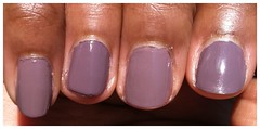
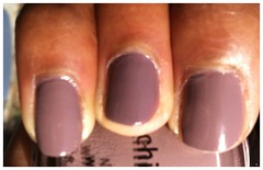
Dupe It Out: CG Channelsque vs. CG Below Deck
Welcome to the first Battle of the Dupes at Polish & Tonic! I love comparing polishes to make sure I have a well-rounded color collection, and not just a bunch of dupes. For this first battle, I heard rumors around the interwebz that Below Deck from the China Glaze Anchors Away spring 2011 collection may be a dupe for a past discontinued favorite, China Glaze Channelesque. I heard yea/nay all over the place, so decided to battle it out for myself.
This was also my first time working with China Glaze polish. I am a self-proclaimed OPI addict - it's all I've ever worn (until last night), with the exception of this one time in 2004 when I tried Essie's Ballet Slippers. Really. Ballet Slippers is the first time I can ever remember noticing salon polishes (and their fun names!), and while I didn't love Essie, I soon found OPI and have been in a committed relationship ever since. However, with blogging, I want to try out new stuff, and a recent trip to a nail supply store in LA had me picking up my first bottles of CG. Instant impression - I love the formula, as both polishes applied with ease, but the brush is so tiny! I guess I'm spoiled by the OPI pro wide brush, but I was not used to having to use so many strokes to apply polish as I had to with CG .
Anyway, on to the battle! Channelesque is on my pinky and middle fingers; Below Deck is on my ring and pointer fingers (and apologies in advance for not being my neatest mani ever - let this pic remind me why not to paint my nails at 11pm while also watching season 1 of Damages).
Channelesque edges slightly more gray, while Below Deck moves slightly more purple.
Verdict: They're dupes
Color to Keep: CG Below Deck by technical decision
While Channelesque and Below Deck have the slightest difference in color, to the naked eye they're the same, and I see no reason to need to have both in one's collection. So with that, Below Deck wins based on 1) availability - Channelesque has been discontinued; and 2) The bolder, more purple coloring works in favor on my complexion, as the less washed out my color is, the better.
Below Deck is getting a little tricky to find these days as the Anchors Away collection released back in February, and I'm not sure if China Glaze automatically adds their newest colors to their regular collection. Either way, snatch it up while you can!
Which polish do you like better? Can you tell the difference between Channelesque and Below Deck? Or has my nail polish fetish gotten so out of control it's blinding me and making me see things that aren't there? Sound off in the comments below!
This was also my first time working with China Glaze polish. I am a self-proclaimed OPI addict - it's all I've ever worn (until last night), with the exception of this one time in 2004 when I tried Essie's Ballet Slippers. Really. Ballet Slippers is the first time I can ever remember noticing salon polishes (and their fun names!), and while I didn't love Essie, I soon found OPI and have been in a committed relationship ever since. However, with blogging, I want to try out new stuff, and a recent trip to a nail supply store in LA had me picking up my first bottles of CG. Instant impression - I love the formula, as both polishes applied with ease, but the brush is so tiny! I guess I'm spoiled by the OPI pro wide brush, but I was not used to having to use so many strokes to apply polish as I had to with CG .
Anyway, on to the battle! Channelesque is on my pinky and middle fingers; Below Deck is on my ring and pointer fingers (and apologies in advance for not being my neatest mani ever - let this pic remind me why not to paint my nails at 11pm while also watching season 1 of Damages).
Below is the contrast in sunlight:
And here's another shot with natural indoor lighting:
Channelesque edges slightly more gray, while Below Deck moves slightly more purple.
Verdict: They're dupes
Color to Keep: CG Below Deck by technical decision
While Channelesque and Below Deck have the slightest difference in color, to the naked eye they're the same, and I see no reason to need to have both in one's collection. So with that, Below Deck wins based on 1) availability - Channelesque has been discontinued; and 2) The bolder, more purple coloring works in favor on my complexion, as the less washed out my color is, the better.
Below Deck is getting a little tricky to find these days as the Anchors Away collection released back in February, and I'm not sure if China Glaze automatically adds their newest colors to their regular collection. Either way, snatch it up while you can!
Which polish do you like better? Can you tell the difference between Channelesque and Below Deck? Or has my nail polish fetish gotten so out of control it's blinding me and making me see things that aren't there? Sound off in the comments below!
Labels:
China Glaze,
Comparisons,
Mushroom/Taupes
11 May 2011
Pink Wednesdays! "Oh hell no, I did not leave the South Side for this!"
It's Wednesday! Pink Wednesday, specifically. There are a group of fab nail polish bloggers who polish up in pink on Wednesdays - a la The Plastics from Mean Girls - and I'm super excited to join in for the first time this week! (Yes, I type - and talk - with a lot of exclamation points. Get used to it.)
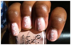
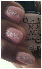
For this week's Pink Wednesday, I really wanted to also try out my first konadicure. For those who don't know, Konad makes nail art that you can stamp onto your nails for funky designs. I drool when I see great konadicures on other bloggers, and really wanted to try one out. But, in case it was an epic fail, I needed to have a pale pink so the fail wouldn't be too obvious. So, I used OPI's Suzi & The Lifeguard as my base color with white Konad polish for the design.
Overall, I'm displeased with the polish, but for my first Konad, I can't hate on it too much. The polish went on very streaky, and even after 3 coats wasn't perfectly smoothed out and there is still VNL (visible nail line). I expected better, OPI! The nail design was easy-peasy to apply, I'm just not a floral kind of person, and the plate that came with the kit only had floral patterns. So I will be heading over to amazon pronto to buy some new plates.
I'm not feeling this konadicure at all, so am counting down the hours until I can peace out of work and go home to change my nail polish! I normally try to stay away from the blues and greens and funky colors during the work week - keeping it conservative and all - but I've picked up some great colors in the past few days and really want to try them out!
What do you think? Was my first Konad manicure an epic fail? How do you like OPI's Suzi & the Lifeguard? And what's your favorite quote from Mean Girls? Sound off in the comments!
09 May 2011
Shatter - The Perfect Nail Fix
I like to think of myself as a girly-girl. I love doing my makeup and painting my nails. I have an impressive collection of designer handbags. And while I haven't mastered the 3" heel (my feet always hurt!) I can rock a hot weave with the best of 'em.
But here's a secret - whenever I go out I look amazing for the first 10 minutes - and then everything starts dropping. Curls drop out of the hair, I drop out of the cute pumps into flats, and my mascara on occasion races to my jaw line like it's the Boston marathon. When it comes to manicures, they're good for the first few minutes - but then I need to jump into jeans, hop in the car, walk the dog, etc., and the dings, dents, and chips start to arrive on my perfectly polished hands. I've found some quick-dry top coats that help, but it's always just a matter of time.
I haven't figured out how to keep my manicures perfectly chip-free, so instead I've found the only thing better than chips - shatters! Yes, I know that shatter/crackle nail polish is all the rage right now. OPI started this year by releasing black shatter nail polish with the Serena Williams Glam Slam and Katy Perry collections, and silver shatter recently released with the Pirates of the Caribbean collection. There is also a red shatter and white shatter dropping this month with the next two installments in the Serena Williams collection, and I've also seen swatches of a blue, navy and turquoise shatter. Shatter is great for vamp or funky nails, but I am all about using it to cover up chips and dents.
Silly me forgot to take a pic of my mangled hands after wearing Dating A Royal all day Saturday, but below is a shot of DAR with silver shatter:
Love this fix! As I mentioned, silver shatter released with the OPI Pirates of the Caribbean collection out this month. I'll be swatching the polishes for the next few days, so look for a post soon!
08 May 2011
OPI Dating A Royal + Kate Spade = Love.
Happy Sunday! It's a cool day here in LA, but still gorgeous out, so I'll be finding some excuse in a bit to get me outside. Hope you're enjoying the day before the work week kicks in again tomorrow!
The bold color I decided to test drive this weekend was OPI's Dating A Royal. Everyone was chattering about this color over the past weeks leading up to the royal wedding, and when I saw this bright royal blue, I had to snatch up a bottle! Dating A Royal is a creme finish. In bright sunlight, the purple undertones shined through, but indoors, it's a pure royal blue - so beautiful!
Here's a shot of Dating A Royal in sunlight:
And another indoor shot, with flash:
Verdict: I LOVE Dating A Royal, and will be sporting it frequently. As I was heading out yesterday with the girls to see Something Borrowed, I had a thought that Dating A Royal was a similar blue to my recent favorite purchase, Kate Spade's La Casita Camden in Blueberry. I pulled out my KS and took a few shots to compare the bag with my nails.
Kate Spade La Casita Camden in Blueberry:
OPI Dating A Royal + KS:
Absolutely friggin' GORGEOUS!!! I love love loved this look! I'm not sure if it's a faux pas to match one's nails to one's handbag, but I don't care - I will be sporting these two together all day, every day.
What do you think? Do you have any polishes that go exceptionally well with a handbag? Or am I crazy for matching the two together? Weigh in!
(Oh, and for the record, Something Borrowed was really cute! Way better than the reviews it's getting from critics. If you love a good RomCom, definitely go see it!)
Labels:
Blues,
Kate Spade,
OPI
06 May 2011
Pretty In Pink
Happy weekend, everyone! If you're a 9-to-5'er like me, the next 48 hours are bliss. Any good plans?
For as badass as I try to act, I am 100% girlie underneath the facade. I love a bright pink nail polish like no one else! Bold colors are almost always flattering on brown shades - you just have to find the right color that matches your personality. For me - that shade is pink. If it's electric pink, I can rock it any time, anywhere.
Lucky for me, I happened to catch a warehouse sale a few weeks ago and snagged a bottle of OPI You're Such A Kabuki Queen from the Japanese Collection (circa 2005, maybe? I'm not sure when the collection released). You're Such A Kabuki Queen is a beautiful bold creme, a bright pink tinted with blue undertones.
I love this color!!! I seriously was distracted all day at work because I kept admiring my nails. I was actually nervous I may like You're Such A Kabuki Queen even more than my regular go-to bright pink, OPI Flower-to-Flower from the 2010 Summer Flutter collection. I didn't think they were dupes, but had to try them out side-by-side and see how they compared. Check it out:
Pointer and ring fingers have Flower-to-Flower; middle and pinky sport YSAKQ.
One big difference between the polishes was application - You're Such A Kabuki Queen applied like a dream (I barely needed a second coat), while Flower-to-Flower was very thin and streaky. Both polishes are applied with 2 coats in the pictures, but if I was doing a full manicure with Flower-to-Flower I'd be seriously tempted to do a third coat for full opacity and even coverage. Either way, I love both colors for different reasons, and am happy to see their not dupes. Both are definite keepers and will be getting a lot of rotation this summer!
FYI, OPI discontinued You're Such A Kabuki Queen at the end of 2010. I haven't seen it available at major retailers, so your best bet is to take a trip to a local beauty salon and see if they still have any available. Happy searching!
02 May 2011
Deal Find! $40 for $100 at Perricone MD
Here's an online deal for all you beautyholics - Total Beauty recently launched and is positioning itself as a 'groupon' for beauty deals. They negotiate deals with independent beauty brands and bring the savings to you!
Well, of course I had to sign up when I heard about this. Have you met me (or seen my ridiculous hordes of beauty products in my apartment)?!?
Today's deal - $100 worth of products from Perricone MD for the bargain price of $40. The voucher is good for one year (until 4/30/2012) and even better - shipping is free with orders over $75 (I seriously hate paying for shipping, so this deal even sweeter than I initially thought!).
Snag it up while you can - it won't last long!
Labels:
Sales
01 May 2011
All That Glitters...
Recently I have become a nail polish fanatic. Late last fall I realized I was dropping a lot of money on mani/pedi's twice a month, and got the Bright Idea that if I did my own nail maintenance, I'd save a lot of money. Well, every single dollar I saved on mani/pedi's has been spent on buying nail polish. It's an addiction! I'm currently up to around 55+ different colors, and my love for nail polish blogs is what inspired me to start Polish & Tonic.
If you haven't caught it yet, you may want to check out the Trade Secret Warehouse Sale which is currently wrapping up. It's only available in stores, so be sure to look if there is a location near you. I went to the Pure Beauty store in Encino last week and managed to snag about 15 new polishes with their buy 1, get 2 free promotion! I picked up several polishes from the OPI Designer Series which I have been dying to try out.
The first color I tried out was DS Reserve, which I found to be a muted pink with a light silver and gold shimmer undertone. I think this polish was also supposed to have a hologram, but I never saw it and couldn't find an angle that brings it out.
Here's a great shot that shows the polish in direct sunlight:
Verdict: I love it! I thought the pink was bright enough to have some pizzazz, but not too bright to not work in a conservative office environment (which I work in) Monday through Friday, I like my polishes to be creative and understated - have to show the co-workers I appreciate beauty and a finished look, but can't look like I just stepped off the March 1987 cover of Seventeen! magazine (don't worry - on the weekends, we cut loose!).
Today I decided to try out a second color from the series, DS Illuminate. This is a warm brown polish with silver and gold flecks, some violet/blue undertones, and an amazing hologram. When it catches the light, this beautiful green/gold iridescent shimmer shines through.
The image doesn't capture the hologram very well, so here's another shot at the hologram in the bottle:
Surprisingly, I didn't like this polish on me as much as I thought I would. The primary brown color matches my skin tone - almost too much. I prefer my polishes to pop! (yes, pronounce the second 'p') at least a little and this one is really muted on me, except for the hologram shimmer. Overall - this is a keeper, but I'll likely be rocking the DS Reserve with more regularity.
OPI Designer Series retails for $12.50 each and both DS Reserve and DS Illuminate are currently available.
Labels:
Browns,
Designer Series,
OPI,
Pinks
Welcome & Introductions!
Welcome to my corner of the interwebz!
You may have made the mistake of assuming this is just another one of the umpteen beauty blogs on the web. Yes, you would be wrong, my friend. While there are great blogs out there that talk about beauty - I'm following a lot of them! - Polish & Tonic focuses on fabulous beauty options for women of color. I myself am a proud NW45 and while I love to read other beauty blogs, when I fall in love with a product, my first thought is 'but what will it look like on me?' Such is the peril of the olive or brown toned woman. My goal is for this blog to give women of color (or just more melanin) a place for reviews, ideas, and suggestions for beauty products that help them to look their best.
Bonus - if you live in Los Angeles, I'll talk a lot about great deals and steals I find, so maybe you can grab up some great items at great prices, or at least the new 'it' colors before everyone else has it.
I want a blog that readers love, so of course I want your feedback! If I'm doing something you like, holla back at ya girl! If you have special requests or want to put me on the find for something unique - I like a challenge! Just drop me a line!
Subscribe to:
Posts (Atom)