Hi Everyone! Yes, I'm still alive! Grad school is kicking my butt! It's been a crazy first quarter, with meeting so many people and learning to juggle work with two classes. How I'm going to survive this for three more years, I'm not sure! Ha. But I'm having a lot of fun figuring it out. The quarter is winding down, with finals next week, so hopefully I can do more blogging over the winter break.
Because even if I haven't been blogging, I've certainly been polishing! And doing more hauling! Ha.
Today I want to share with you a lovely polish I picked up in September for Fashion Night Out. I've come to look forward to this event so much, and primarily for the limited edition polishes Chanel releases for the occasion. In 2010 it was Les Khakis de Chanel, with the much loved Khaki Brun, Khaki Rose, and everyone's favorite Khaki Vert. Last year gave us Les Jeans de Chanel, with three stunning takes on blue in Coco Blue, Blue Boy, and Blue Rebel. What did Chanel have in store for us for 2012? A slightly different take - three exclusive polishes, but three matching lipsticks as well - Les Twin-Sets de Chanel. I passed on all three lipsticks (and am sorely regretting not picking up L'Provocante now), but did snatch up all three polishes, the first of which I have to show you today - Infidele.
Chanel describes Infidele as an 'intense pink with a burst of energy', and that it most definitely is! And while it's certainly bright, it has a slight dusty quality that made it perfect for the sunny fall day when I wore it. This is two coats of Infidele, and the formula was buttery perfection. Normally I don't notice formula -as in, I don't really have problems with most - but when a formula is exceptional, I notice. And Infidele is definitely exceptional.
Infidele was certainly ready for its close-up:
... and here is a super warmed-up version of Infidele, in bright direct sunlight - it shows the hint of rosy dusk in the color:
Is Infidele the most unique color I've ever seen? Probably not. Did I have anything like it in my collection? Nope. Am I happy it came home with me with the other two beauties, Delicatesse and Provocation? Absolutely! (Reviews on both coming soon!)
If you missed it in September, you can still purchase Infidele from Chanel.com. Each polish retails for $26 - a steep price tag, so only take the plunge if you love Infidele or you're a Chanel addict like yours truly. :)
Showing posts with label Pinks. Show all posts
06 December 2012
13 June 2012
Dior Pink Graffiti
Hey Everyone! Happy Hump Day! It’s been a crazy week so far for me, with a long day yesterday and another one in store for today, so I decided to take 20 minutes to treat myself to do something I like and is overdue – a new post for Polish & Tonic!
Today I have for you the last polish I picked up from this past spring’s Anselm Reyle for Dior collection, Pink Graffiti. If you remember, the collection included five polishes, including Electric Blue, which I have previously reviewed, and Ultra Violet, which I photographed but never reviewed. Oops!! That will be coming shortly hahaha. Dior Pink Graffiti is a bright blue-based pink crème that leans toward but still isn’t quite neon. It is gorgeous and vibrant, though! Pink Graffiti has the excellent formula I’ve come to love and expect from Dior, and this is 2 buttery coats. Take a look!
Pink Graffiti in sunlight…
… and in shade…
Pink Graffiti was such a chameleon to photograph! The photos are a little too warm – Pink Graffiti has a little more blue than photographed here – but these photos really show the vibrancy of Pink Graffiti the best. Needless to say, I love it! I think Dior really hit it out of the park with this collection, and I have to keep reminding myself to not buy Untitled Black (because, um, it’s black) and Metallic Silver (a dupe for Silver Lake, which I already own) to complete the collection, but I’m not sure if I’m going to win this battle against myself.
Pink Graffiti, along with the other polishes in the Anselm Reyle for Dior collection, is available online at Dior.com and at Saks (Electric Blue and Ultra Violet are sold out at Saks, but all are still available at Dior’s website). Each polish retails for $23.
Today I have for you the last polish I picked up from this past spring’s Anselm Reyle for Dior collection, Pink Graffiti. If you remember, the collection included five polishes, including Electric Blue, which I have previously reviewed, and Ultra Violet, which I photographed but never reviewed. Oops!! That will be coming shortly hahaha. Dior Pink Graffiti is a bright blue-based pink crème that leans toward but still isn’t quite neon. It is gorgeous and vibrant, though! Pink Graffiti has the excellent formula I’ve come to love and expect from Dior, and this is 2 buttery coats. Take a look!
Pink Graffiti in sunlight…
… and in shade…
Pink Graffiti was such a chameleon to photograph! The photos are a little too warm – Pink Graffiti has a little more blue than photographed here – but these photos really show the vibrancy of Pink Graffiti the best. Needless to say, I love it! I think Dior really hit it out of the park with this collection, and I have to keep reminding myself to not buy Untitled Black (because, um, it’s black) and Metallic Silver (a dupe for Silver Lake, which I already own) to complete the collection, but I’m not sure if I’m going to win this battle against myself.
Pink Graffiti, along with the other polishes in the Anselm Reyle for Dior collection, is available online at Dior.com and at Saks (Electric Blue and Ultra Violet are sold out at Saks, but all are still available at Dior’s website). Each polish retails for $23.
Labels:
Dior,
Pinks,
Spring 2012
10 May 2012
Skittles Mani with Julep Gayle and Cameron
Good morning! How’s everyone’s week going so far? Pretty busy over here in LA, but not too bad, and the weekend’s almost here! Yay! I can’t wait to unwind and relax.
Today I have for you a fun mani I decided to do last night. I’ve totally done the accent nail thing in the past, and this is really just an expansion of it – nothing too crazy for work! I did a skittles mani using Julep Gayle and Julep Cameron. Gayle is a dark, eggplant purple crème polish while Cameron is a bright, blue-based pink crème. Neither are neon, but they are super bright, so I thought it was right in line with the bright nails trend currently underway. As is typical of Julep, both formulas were highly pigmented and could have easily been one-coaters. I did two coats for this mani for flawless color. Take a look!
And of course, the closeup.
I love them both! I had already done a mani before with Julep Gayle, so I already knew it was a winner, but look at Cameron! Such a stunner too!
Gayle and Cameron are both still available at the Julep site, and you can now purchase Julep polishes at select Sephora stores, too! Definitely check them out. They retail for $14 per polish.
Today I have for you a fun mani I decided to do last night. I’ve totally done the accent nail thing in the past, and this is really just an expansion of it – nothing too crazy for work! I did a skittles mani using Julep Gayle and Julep Cameron. Gayle is a dark, eggplant purple crème polish while Cameron is a bright, blue-based pink crème. Neither are neon, but they are super bright, so I thought it was right in line with the bright nails trend currently underway. As is typical of Julep, both formulas were highly pigmented and could have easily been one-coaters. I did two coats for this mani for flawless color. Take a look!
And of course, the closeup.
I love them both! I had already done a mani before with Julep Gayle, so I already knew it was a winner, but look at Cameron! Such a stunner too!
Gayle and Cameron are both still available at the Julep site, and you can now purchase Julep polishes at select Sephora stores, too! Definitely check them out. They retail for $14 per polish.
04 February 2012
2012 Spring Flings: OPI Holland Collection Part I
Happy Saturday! What’s everyone up to this weekend? I’m heading out to Santa Monica later to help celebrate my one of my bestie’s birthday. I’ll also be having a few extra drinks to celebrate the end of the graduate school application process! Yay! After 4 long months, the tests are done, the scores are in, and the applications have been submitted! Now I’m just twiddling my thumbs till March, when I’ll find out where I’ve been accepted!
Today I have for you the first swatches of the collection I’ve most been obsessing for this spring, the OPI Holland Collection. I have been drooling over the swatches on the blogosphere for the past few weeks, and now, they are mine! I’m so happy! The collection is made up of six shimmers and six cremes. The shimmers are what really had me excited, so I’m going to show you three today, and the three others tomorrow. Read on!
Up first is I Don’t Give A Rotterdam. Such a cute name! IDGAR is a light blue base with a gorgeous silver shimmer. The base reminds me a lot of a periwinkle blue. Seriously, OPI outdid itself with these shimmers! This is 3 super thin coats of IDGAR. I could have gotten away with 2 slightly thicker coats, but I’m in the habit of 3 coats to avoid peeling, so that’s what I did. Please excuse any bumpiness on my nails – they’re peeling – bleh! – but it's not bubbles in the polish. Take a look!
The next shimmer is I Have A Herring Problem. This polish is a slightly smoky teal base with a rose gold shimmer. Again, stunning! At first I constantly thought this was really close in color to I Don’t Give A Rotterdam, but now that I have them side-by-side, they are two distinct polishes for sure. Again, this is 3 thin coats of IHAHP:
The third polish I have for you today is Pedal Faster Suzi!, a soft, slightly muted pink with a silver shimmer. The shimmer is similar to the same silver glory in I Don’t Give A Rotterdam. At first I wasn’t very interested in Pedal Faster Suzi!, but since I was buying the other shimmers, I thought I’d pick this one up as well – my OCD strikes again! I’m glad it did, though, as I loved this polish! It is a soft pink, but the slightly grayed tone to the color keeps it from being too safe. This is definitely a fun polish for work!
And there you have it! The first 3 of 6 shimmers from the new OPI Holland collection! Are you loving these polishes as much as I am? Of the three here, I Have A Herring Problem is probably my favorite, but I seriously love all three of these and am happy to welcome them to my collection!
The OPI Holland collection will be available beginning this Thursday, February 8, at your regular OPI retailers, including Ulta, JC Penny’s and beauty retailers. Each polish retails for $8.50 for a 0.5 fl oz bottle.
What do you think of the collection so far? Sound off in the comments below!
Labels:
Blues,
OPI,
Pinks,
Spring 2012
12 October 2011
Pink Wednesdays: RBL Poco a Poco
Before I get to today’s post, I want to quickly mention that this Sunday I will be participating in AIDS Walk LA, a 10k charity walk/run to raise HIV/AIDS awareness and help support the amazing organizations in the Los Angeles area who provided much needed food, medical care, and services to people living with HIV/AIDS as well as educational and prevention programs to the community to reduce the number of new HIV/AIDS cases reported. This walk is important to me, as African-Americans and women are disproportionately impacted by the HIV/AIDS virus, and this is one way I help support HIV/AIDS awareness every year. If you have a minute, please drop a comment below to encourage and support me in this effort, or stop by my donation page and help me meet my personal goal to raise $500. $5 would be a big help!
On to today’s mani! The recent RAOK I received from a lovely friend included a polish from Rescue Beauty Lounge’s 2011 fall collection, Poco a Poco. Poco a Poco is a dusty pink polish with a gold shimmer. The color really reminds me of a more grey version of OPI Sparrow Me The Drama from this past spring’s Pirates of the Caribbean collection; memo to self to do a comparison post of the two later this week! Either way, Poco a Poco continues the tradition of the RBL exceptional formula, as this was very easy to apply. Below is 2 coats for full opacity. Take a look!
Of course I love Poco a Poco, and am happy to have it join my RBL collection. This was a great work-friendly polish and the subtle gold shimmer is stunning! Absolute love.
Poco a Poco is currently in stock and only available online at rescuebeauty.com I’ll be picking up one or two of her friends from the fall collection later this week at the RBL pre-order for the Bring-It-Back polishes. This pre-order will include the re-launch of past RBL faves (Mismas, Orbis, Anne, Scrangie, 360, and Locavore). The pre-order is a private event, so if you’re interested, please be sure to head over to rescuebeauty.com to sign up to on their VIP mailing list! You’ll receive instructions Friday morning via email on how to participate in the pre-order.
Make it a great day!
Labels:
Pinks,
Rescue Beauty Lounge
14 September 2011
Pink Wednesdays: OPI To The Rescue!
Happy Hump Day!
This morning I was looking through my untried pink polishes in order to decide what to wear today, and originally I was planning to bring you a pink polish from my first Julep maven box. I did my nails all up - and the polish turned out to be a not-hot, streaky, bubbly mess! To add insult to injury, I even used all Julep products (base coat, polish, top coat) for the mani! I was not happy - Julep's formulas I'm learning can be very inconsistent one polish to the next - but luckily I was stuck on a conference call for work, so I had time to swatch on a new mani!
The mani started today with OPI Sparrow Me the Drama. I had previously reviewed Sparrow Me the Drama with a few other polishes from the OPI Pirates of the Caribbean collection a few months ago, but I hadn't yet actually worn it as a mani - surprising, because I loved the color so much in my review! Well, SMtD came to the rescue this morning. It's a rose-pink creme with a slight dusky quality to it; it made me think of a pink nail polish with a little dirty water mixed in (not as gross as that sounds, I promise!). I also decided to bling the mani up a bit, so I added a coat of OPI I Lily Love You from the Nice Stems collection, also released earlier this summer. ILLY is a holographic flakie polish in a pinkish red jelly base. I think the combo came out well, but take a look for yourself!
Here's a close up of the flakie gorgeousness that is ILLY:
This is such a sparkle-tastic mani! The reddish-pink jelly base of ILLY really transformed the color of Sparrow Me the Drama, but I was okay with it. It makes the mani more warm toned all-around, and I just keep staring at my nails today, looking at the holo flakies from ILLY. Love!
Both Sparrow Me the Drama and I Lily Love You are still available. You may want to check out your local ULTA to find them, or if you're in CA, head to Planet Beauty - one of my new favorite boutique beauty shops.
This morning I was looking through my untried pink polishes in order to decide what to wear today, and originally I was planning to bring you a pink polish from my first Julep maven box. I did my nails all up - and the polish turned out to be a not-hot, streaky, bubbly mess! To add insult to injury, I even used all Julep products (base coat, polish, top coat) for the mani! I was not happy - Julep's formulas I'm learning can be very inconsistent one polish to the next - but luckily I was stuck on a conference call for work, so I had time to swatch on a new mani!
The mani started today with OPI Sparrow Me the Drama. I had previously reviewed Sparrow Me the Drama with a few other polishes from the OPI Pirates of the Caribbean collection a few months ago, but I hadn't yet actually worn it as a mani - surprising, because I loved the color so much in my review! Well, SMtD came to the rescue this morning. It's a rose-pink creme with a slight dusky quality to it; it made me think of a pink nail polish with a little dirty water mixed in (not as gross as that sounds, I promise!). I also decided to bling the mani up a bit, so I added a coat of OPI I Lily Love You from the Nice Stems collection, also released earlier this summer. ILLY is a holographic flakie polish in a pinkish red jelly base. I think the combo came out well, but take a look for yourself!
Here's a close up of the flakie gorgeousness that is ILLY:
This is such a sparkle-tastic mani! The reddish-pink jelly base of ILLY really transformed the color of Sparrow Me the Drama, but I was okay with it. It makes the mani more warm toned all-around, and I just keep staring at my nails today, looking at the holo flakies from ILLY. Love!
Both Sparrow Me the Drama and I Lily Love You are still available. You may want to check out your local ULTA to find them, or if you're in CA, head to Planet Beauty - one of my new favorite boutique beauty shops.
24 August 2011
Pink Wednesdays: Chanel Morning Rose
Happy Hump Day! I have a quick lunchtime post for you!
For Pink Wednesday I have for your today Chanel Morning Rose. Morning Rose is a pale warm pink with gold flecks throughout. Normally I am not one for warm-toned pinks, but the more swatches I saw online, the more the gold flecks captivated me. I thought it would be a sheer polish, because it looks so delicate, but Morning Rose can stand on her own - just 3 coats for full opacity.
The gold flecks were difficult to capture on film, so here's a shot of the bottle where it's much more pronounced:
It's a little tricky for me to describe how I feel about Morning Rose. It's not delicate or sheer enough to be a classic look on me - it's a wee bit more bold than that - but it's also not a bold bright with an edge. It's safe for work on me, but it definitely stands out, and I caught myself eying it a few times through the day. I can't tell you exactly when I'll do a mani with Morning Rose again, but I'll know the moment when I see it - when it will be a perfect accompaniment to a fantastic outfit - so it's going to stick around in my stash until that moment comes!
Morning Rose was a limited edition polish released this summer as a part of the Chanel Les Fleurs d'Ete Collection. It is currently sold out online at Chanel and Nordstrom - boo! - but call around to your local Nordstrom and Macy's Chanel counters. I still see it at several stores while I'm out and about, so pick one up while you still can!
What do you think? Are the gold flecks amazing to you, too? Do you like warm-toned pinks like Morning Rose? And did you pick up any other polishes from Chanel's summer collection, like the much more hyped Mimosa?
For Pink Wednesday I have for your today Chanel Morning Rose. Morning Rose is a pale warm pink with gold flecks throughout. Normally I am not one for warm-toned pinks, but the more swatches I saw online, the more the gold flecks captivated me. I thought it would be a sheer polish, because it looks so delicate, but Morning Rose can stand on her own - just 3 coats for full opacity.
The gold flecks were difficult to capture on film, so here's a shot of the bottle where it's much more pronounced:
It's a little tricky for me to describe how I feel about Morning Rose. It's not delicate or sheer enough to be a classic look on me - it's a wee bit more bold than that - but it's also not a bold bright with an edge. It's safe for work on me, but it definitely stands out, and I caught myself eying it a few times through the day. I can't tell you exactly when I'll do a mani with Morning Rose again, but I'll know the moment when I see it - when it will be a perfect accompaniment to a fantastic outfit - so it's going to stick around in my stash until that moment comes!
Morning Rose was a limited edition polish released this summer as a part of the Chanel Les Fleurs d'Ete Collection. It is currently sold out online at Chanel and Nordstrom - boo! - but call around to your local Nordstrom and Macy's Chanel counters. I still see it at several stores while I'm out and about, so pick one up while you still can!
What do you think? Are the gold flecks amazing to you, too? Do you like warm-toned pinks like Morning Rose? And did you pick up any other polishes from Chanel's summer collection, like the much more hyped Mimosa?
15 August 2011
Julep Maven: August Sneak Peek Box!
Good Morning!
Remember a little over a week ago I had mentioned the launch of the Julep Maven program? To follow-up, today we're going to take a look at all the goodies that arrived for me in this month's Sneak Peek Box! (Click on any of the photos to see a larger image!)
The unassuming package...
Everything was packed very nicely inside. There was a card with information on my 'Classic With A Twist' Sneak Peek Box and all of the goodies inside, as well as a warm welcome letter and thank you for being one of the first 100 Mavens! Woo hoo! Maven is such a great program that I'm going to keep the letter so I can say I knew her when!
The first goodies: Julep Glycolic Hand Scrub, and samples of the hand scrub as well as their hand lotion. Squee! I do not take enough time in my routine to regularly exfoliate my hands, so I'm so happy to have the Glycolic Hand Scrub to get me in the habit!
Then, the coup d'etat of the package: Carrie, a "classic, cotton candy pink," and Alfre, a "royal metropolitan purple." Carrie is currently available on the Julep site, but Alfre will be released in September/October as a part of Julep's Fall 2011 Collection. How awesome is it to get Alfre ahead of her release? I love it! Julep Nail Therapy, a base coat, was also included with the 2 polishes.
I swatched Carrie and Alfre on a nail wheel, to give you a better idea of what the polishes look like:
And here's one more look at all of my Julep goodies.
Overall, I am ecstatic about everything I received in my Sneak Peak Box for August! Both Carrie and Alfre are colors I love, the hand scrub is a perfect addition to my beauty regimen, and I can always use basecoat that helps strengthen my soft, peeling nails. Julep gets an A+ in packaging and presentation, too. Can't wait to see what they have in store next month!
Don't forget - you can join Julep Maven for $19.99/month and receive over $40 worth of Julep goodies! This month's Sneak Peek Box included products valued at over $70, which was amazing!
What do you think? Did anything in this month's Sneak Peak Box pique your interest? And have you joined Julep Maven yet? If not, get thee to Julep's site now!
Remember a little over a week ago I had mentioned the launch of the Julep Maven program? To follow-up, today we're going to take a look at all the goodies that arrived for me in this month's Sneak Peek Box! (Click on any of the photos to see a larger image!)
The unassuming package...
Everything was packed very nicely inside. There was a card with information on my 'Classic With A Twist' Sneak Peek Box and all of the goodies inside, as well as a warm welcome letter and thank you for being one of the first 100 Mavens! Woo hoo! Maven is such a great program that I'm going to keep the letter so I can say I knew her when!
The first goodies: Julep Glycolic Hand Scrub, and samples of the hand scrub as well as their hand lotion. Squee! I do not take enough time in my routine to regularly exfoliate my hands, so I'm so happy to have the Glycolic Hand Scrub to get me in the habit!
Then, the coup d'etat of the package: Carrie, a "classic, cotton candy pink," and Alfre, a "royal metropolitan purple." Carrie is currently available on the Julep site, but Alfre will be released in September/October as a part of Julep's Fall 2011 Collection. How awesome is it to get Alfre ahead of her release? I love it! Julep Nail Therapy, a base coat, was also included with the 2 polishes.
I swatched Carrie and Alfre on a nail wheel, to give you a better idea of what the polishes look like:
And here's one more look at all of my Julep goodies.
Overall, I am ecstatic about everything I received in my Sneak Peak Box for August! Both Carrie and Alfre are colors I love, the hand scrub is a perfect addition to my beauty regimen, and I can always use basecoat that helps strengthen my soft, peeling nails. Julep gets an A+ in packaging and presentation, too. Can't wait to see what they have in store next month!
Don't forget - you can join Julep Maven for $19.99/month and receive over $40 worth of Julep goodies! This month's Sneak Peek Box included products valued at over $70, which was amazing!
What do you think? Did anything in this month's Sneak Peak Box pique your interest? And have you joined Julep Maven yet? If not, get thee to Julep's site now!
10 August 2011
Nails Inc. Week/Pink Wednesday: Brook Street
Happy Hump Day! It's Wednesday, which means I'm officially allowed to start day-dreaming about my weekend and all it holds in store for me. Then I remember the only thing I need to be doing this weekend is packing my crap up, and I instantly wake from my daydream and am quite happy to be back in the cold harsh reality that is my office!
In celebration of Nails Inc. Week @ Polish & Tonic, and Pink Wednesday, I bring to you today Nails Inc. Brook Street. Brook Street is described as a "pure coral" but I see it much more as a bright pink creme with a coral tint. This was another 3-coat manicure as I had another unsteady hand; I'm thinking I may need to lay off the coffee for awhile. Right?
I am an instant fan of Brook Street! She was a bit bright for work, but a lot of fun to show off in the summer sun. However, when I was applying her, I had the sneaky feeling that maybe there was a dupe in my collection already, so I went to the Helmer to look for similar colors. I came up with Rescue Beauty Lounge Coral and Julep Natalie.
Here's a look at Coral, Brook Street, and Natalie on the nail wheel:
The verdict: RBL Coral and Brook Street are not exact dupes, but they are really really close. Coral had a little more red than Brook Street, but it's not really noticeable - I only saw it when I held the nail wheel swatch over my own painted nail. Given that Coral is more sheer and required a minimum of 3 coats on the nail wheel - which is a lot - I would recommend picking up Brook Street for your own personal collection. Julep Natalie was also close, but noticeably more orange than Brook Street. A casual polish fan probably doesn't need both Brook Street and Natalie in their collection, but for this addict, I'm keeping them both!
Brook Street was released as a part of the Spring/Summer '11 Collection and is available at select Sephora locations and online at sephora.com. Julep Natalie retails for $14 for a 0.27 fl oz bottle, and you can find it online at julep.com.
What do you think? Do you have any of these polishes, or anything else in the pinkish coral family? Can you even see the difference between these polishes, or have I just been sniffing too many polish fumes and need to get my head cleared?
In celebration of Nails Inc. Week @ Polish & Tonic, and Pink Wednesday, I bring to you today Nails Inc. Brook Street. Brook Street is described as a "pure coral" but I see it much more as a bright pink creme with a coral tint. This was another 3-coat manicure as I had another unsteady hand; I'm thinking I may need to lay off the coffee for awhile. Right?
I am an instant fan of Brook Street! She was a bit bright for work, but a lot of fun to show off in the summer sun. However, when I was applying her, I had the sneaky feeling that maybe there was a dupe in my collection already, so I went to the Helmer to look for similar colors. I came up with Rescue Beauty Lounge Coral and Julep Natalie.
Here's a look at Coral, Brook Street, and Natalie on the nail wheel:
The verdict: RBL Coral and Brook Street are not exact dupes, but they are really really close. Coral had a little more red than Brook Street, but it's not really noticeable - I only saw it when I held the nail wheel swatch over my own painted nail. Given that Coral is more sheer and required a minimum of 3 coats on the nail wheel - which is a lot - I would recommend picking up Brook Street for your own personal collection. Julep Natalie was also close, but noticeably more orange than Brook Street. A casual polish fan probably doesn't need both Brook Street and Natalie in their collection, but for this addict, I'm keeping them both!
Brook Street was released as a part of the Spring/Summer '11 Collection and is available at select Sephora locations and online at sephora.com. Julep Natalie retails for $14 for a 0.27 fl oz bottle, and you can find it online at julep.com.
What do you think? Do you have any of these polishes, or anything else in the pinkish coral family? Can you even see the difference between these polishes, or have I just been sniffing too many polish fumes and need to get my head cleared?
Labels:
Comparisons,
Corals,
Julep,
Nails Inc,
Pinks,
Rescue Beauty Lounge
03 August 2011
Pink Wednesdays: Zoya Areej
Good Morning! Oh, how I've missed you guys! I had a great long weekend in Virginia Beach with my family, but getting back to LA was heck on Sunday! First my flight from Norfolk to Charlotte was delayed due to storms, and then leaving Charlotte to fly to LAX we were delayed due to a disabled plane on the runway and later storms. I was delayed overall about 3 1/2 hours, crazy! It did make me realize, though, that I am so spoiled living in LA - it's not near any other airports, so we never have congestion issues with landing/taking off (like you have in NYC), and I've never had a flight delayed due to weather conditions. Aaah, there are so many benefits to west coast living!
Today we're celebrating Pink Wednesday with Zoya Areej. Areej is bright pink creme that has blue undertones. It applied easily in 2 coats, as I've come to expect from Zoya polishes. they really do have a great, consistent formula! I occasionally find 3-coaters with other salon brands, but not at all yet with Zoya. Take a look:

When I tried Areej on, I thought she looked familiar and I might have a similar color already in my collection. I dug around and pulled out one of my favorite pinks, OPI Dim Sum Plum, to see if I had a dupe on my hands. Check out the swatch below!
To my eye, in the direct sunlight they look identical. However, with artificial lighting and flash, I can see a slight difference. Areej looks at tad more blue than Dim Sum Plum. However, I don't think this is noticeable to most eyes, so for all intents and purposes I'm calling them dupes. I am a huge fan of Dim Sum Plum, which means Areej is likely going to make her way over to my share/swap drawer. She is a beauty, though, so maybe I'll change my mind!
Zoya Areej was released as a part of Zoya's Summertime Collection this summer. It retails for $8 per polish and can be purchased at Zoya.com (be on the lookout for promotions! they have them all the time) or in store at Ulta and other salon retailers.
What do you think? Do you think Areej and Dim Sum Plum are dupes? Which formula do you prefer, Zoya or OPI? And do you have any other colors from the Zoya Summertime Collection?
Today we're celebrating Pink Wednesday with Zoya Areej. Areej is bright pink creme that has blue undertones. It applied easily in 2 coats, as I've come to expect from Zoya polishes. they really do have a great, consistent formula! I occasionally find 3-coaters with other salon brands, but not at all yet with Zoya. Take a look:
When I tried Areej on, I thought she looked familiar and I might have a similar color already in my collection. I dug around and pulled out one of my favorite pinks, OPI Dim Sum Plum, to see if I had a dupe on my hands. Check out the swatch below!
To my eye, in the direct sunlight they look identical. However, with artificial lighting and flash, I can see a slight difference. Areej looks at tad more blue than Dim Sum Plum. However, I don't think this is noticeable to most eyes, so for all intents and purposes I'm calling them dupes. I am a huge fan of Dim Sum Plum, which means Areej is likely going to make her way over to my share/swap drawer. She is a beauty, though, so maybe I'll change my mind!
Zoya Areej was released as a part of Zoya's Summertime Collection this summer. It retails for $8 per polish and can be purchased at Zoya.com (be on the lookout for promotions! they have them all the time) or in store at Ulta and other salon retailers.
What do you think? Do you think Areej and Dim Sum Plum are dupes? Which formula do you prefer, Zoya or OPI? And do you have any other colors from the Zoya Summertime Collection?
Labels:
Comparisons,
OPI,
Pinks,
Zoya
27 July 2011
Pink Wednesdays: OPI Blushingham Palace
Happy Wednesday! (Really, every day is happy for me this week!) I'm up an at 'em early this morning, doing laundry and packing for Virginia Beach. I'm hoping to actually do a lot of blogging today to keep you all happy while I'm gone for the next few days - fingers crossed I get it all done!
It's another Wednesday, which means another pink polish! Today I have for you OPI Blushingham Palace. Blushingham Palace is a soft mauve-y pink with a pearl finish. I have to admit, this is not normally my kind of color - I usually do not like pearl finishes, as I constantly imagine they're something my mother would wear, and I don't normally go for (what I thought was) red undertone pinks; I prefer cooler blue-based pinks. So how would Blushingham Palace turn out? Let's take a look!

...and another look, with flash:

Initially I thought Blushingham Palace had a red/warmer undertone, but as I was writing this I really am seeing a lot of blue/purple, especially under the flash, so the polish is much cooler than I thought. I definitely loved wearing this polish, and found myself checking out my nails throughout the day. It is a very sophisticated nail - perfect for work, or attending events where you want to show style without being overly 'look at me!' (think 'guest at a wedding').
Blushingham Palace was originally released way back in 2003 as a part of OPI's British Collection (I would have drooled over the entire collection, I'm sure, if I was into nail polish then - I love all things English!). It was discontinued at the end of 2010, but you can still find it fairly easily if you don't mind doing a little bit of searching. Online retailers such as Amazon, TransDesign, or AveYou are you best bets. Or, you may want to head to your local Trade Secret or Beauty First salon, as this is where I found my bottle in a clearance bin (even better!).
What do you think? Are you feeling this delicate pink color? Do you have any similar colors or dupes for Blushingham Palace, since it's now discontinued? Or are you still in the mood for the bright yellows, blues, and corals of summer? Sound off in the comments!
It's another Wednesday, which means another pink polish! Today I have for you OPI Blushingham Palace. Blushingham Palace is a soft mauve-y pink with a pearl finish. I have to admit, this is not normally my kind of color - I usually do not like pearl finishes, as I constantly imagine they're something my mother would wear, and I don't normally go for (what I thought was) red undertone pinks; I prefer cooler blue-based pinks. So how would Blushingham Palace turn out? Let's take a look!

...and another look, with flash:
Initially I thought Blushingham Palace had a red/warmer undertone, but as I was writing this I really am seeing a lot of blue/purple, especially under the flash, so the polish is much cooler than I thought. I definitely loved wearing this polish, and found myself checking out my nails throughout the day. It is a very sophisticated nail - perfect for work, or attending events where you want to show style without being overly 'look at me!' (think 'guest at a wedding').
Blushingham Palace was originally released way back in 2003 as a part of OPI's British Collection (I would have drooled over the entire collection, I'm sure, if I was into nail polish then - I love all things English!). It was discontinued at the end of 2010, but you can still find it fairly easily if you don't mind doing a little bit of searching. Online retailers such as Amazon, TransDesign, or AveYou are you best bets. Or, you may want to head to your local Trade Secret or Beauty First salon, as this is where I found my bottle in a clearance bin (even better!).
What do you think? Are you feeling this delicate pink color? Do you have any similar colors or dupes for Blushingham Palace, since it's now discontinued? Or are you still in the mood for the bright yellows, blues, and corals of summer? Sound off in the comments!
20 July 2011
Pink Wednesdays: OPI Do You Think I'm Tex-y?
Happy Hump Day!
I have been slacking off on celebrating Pink Wednesdays lately. Seriously, if I was really one of the Plastics, they so would have banned my arse by now. But I really do want to be one of the cool kids in school again, so I have for you today OPI Do You Think I'm Tex-y?. DYTIT was one of the six "sorbet-like" polishes (read: jellies) from the OPI Texas Collection released this past spring. I reviewed Houston! We Have a Purple a few weeks ago from the collection. DYTIT is a bright raspberry-tinted pink polish with the high gloss finish we've come to love from jellies. We also know jellies apply very sheer, and for the photos below it's 3 medium coats and still a lot of VNL showing. Take a look:
And the close-up:

I actually wore this mani a few months ago - it was the first sorbet/jelly I tried from the Texas collection. I initially loved it, but when I swatched the polish, and looking also at these photos, I realized the VNL drives me CRAZY. I just hate to see the nails underneath - blame it one too many french manicures in my past. I guess I could use a white base coat, like a ridge filler, to minimize VNL, but I still don't think it would completely go away. As much as I love this color, I fear it's going to have to make it's way to the swap/donation drawer of my awesome new Helmer. Too bad.
What do you think? Am I just being too intolerable of VNL? Have you tried any of the other polishes from the Texas collection?
I have been slacking off on celebrating Pink Wednesdays lately. Seriously, if I was really one of the Plastics, they so would have banned my arse by now. But I really do want to be one of the cool kids in school again, so I have for you today OPI Do You Think I'm Tex-y?. DYTIT was one of the six "sorbet-like" polishes (read: jellies) from the OPI Texas Collection released this past spring. I reviewed Houston! We Have a Purple a few weeks ago from the collection. DYTIT is a bright raspberry-tinted pink polish with the high gloss finish we've come to love from jellies. We also know jellies apply very sheer, and for the photos below it's 3 medium coats and still a lot of VNL showing. Take a look:
And the close-up:
I actually wore this mani a few months ago - it was the first sorbet/jelly I tried from the Texas collection. I initially loved it, but when I swatched the polish, and looking also at these photos, I realized the VNL drives me CRAZY. I just hate to see the nails underneath - blame it one too many french manicures in my past. I guess I could use a white base coat, like a ridge filler, to minimize VNL, but I still don't think it would completely go away. As much as I love this color, I fear it's going to have to make it's way to the swap/donation drawer of my awesome new Helmer. Too bad.
What do you think? Am I just being too intolerable of VNL? Have you tried any of the other polishes from the Texas collection?
21 June 2011
NOTD: Julep Natalie
Good Morning!
One of the reasons I'm such a nail polish addict is because I spend a lot of time online talking to other nail polish addicts and learning so much about polish! I'm always surprised at how much I don't know. I recently found an online community I love, and the ladies have completely opened me up to nail polish brands I'd never heard of (and never would) before. Yes, you have OPI, Essie, China Glaze, Zoya, Sally Hansen, and others, and all of these brands are good at some things and worse at others. But even beyond these major brands, there are some special polishes out there, and today's post is here to introduce you to a boutique brand out of the pacific northwest - Julep Nail Parlor.
I first learned about Julep from a blogger, and I have been in love with their bright colors ever since I first laid eyes on them. Julep (and most boutique brands) is a bit pricey - each polish retails for $14 for a 0.27 fl oz bottle (about 1/2 the size of what you get from OPI, Orly, etc. for almost twice the price). So a few weeks ago when Lucky Magazine had a deal of the day to pick up 4 Julep polishes for 60% off, you know I had to snatch some up!
The summer set came with four polishes: Amy, Helena, Natalie, and Jennifer. I have for you today Natalie, described as a bright 'honeysuckle pink' on Julep's site. Natalie is a beautiful pink with some orange tones - at first I thought it might be a pink-tinged coral, which is how it appears indoors/low lighting. However, after stepping outside this morning, I knew she was the bright pink as promised. The formula on Julep was really nice - I actually thought it went on a little thick, and I prefer slightly thinner polish. I had nearly full opacity in one coat, but put a second on just because. Take a look:
And here's an up-close shot of the polish:
Julep Natalie is definitely a keeper! Although, in the interest of full disclosure, because it applied so thick, I've already found 2 small chips in the mani after typing at work all day. Sadness! However, I'm still completely in love with this color and brand, and can't wait to take the other 3 colors out for a test drive!
What do you think? Have you tried other colors from Julep? Are you a fan of Julep, or any other boutique nail polish brands? And just how much are you willing to spend on a bottle of nail polish?
One of the reasons I'm such a nail polish addict is because I spend a lot of time online talking to other nail polish addicts and learning so much about polish! I'm always surprised at how much I don't know. I recently found an online community I love, and the ladies have completely opened me up to nail polish brands I'd never heard of (and never would) before. Yes, you have OPI, Essie, China Glaze, Zoya, Sally Hansen, and others, and all of these brands are good at some things and worse at others. But even beyond these major brands, there are some special polishes out there, and today's post is here to introduce you to a boutique brand out of the pacific northwest - Julep Nail Parlor.
I first learned about Julep from a blogger, and I have been in love with their bright colors ever since I first laid eyes on them. Julep (and most boutique brands) is a bit pricey - each polish retails for $14 for a 0.27 fl oz bottle (about 1/2 the size of what you get from OPI, Orly, etc. for almost twice the price). So a few weeks ago when Lucky Magazine had a deal of the day to pick up 4 Julep polishes for 60% off, you know I had to snatch some up!
The summer set came with four polishes: Amy, Helena, Natalie, and Jennifer. I have for you today Natalie, described as a bright 'honeysuckle pink' on Julep's site. Natalie is a beautiful pink with some orange tones - at first I thought it might be a pink-tinged coral, which is how it appears indoors/low lighting. However, after stepping outside this morning, I knew she was the bright pink as promised. The formula on Julep was really nice - I actually thought it went on a little thick, and I prefer slightly thinner polish. I had nearly full opacity in one coat, but put a second on just because. Take a look:
And here's an up-close shot of the polish:
Julep Natalie is definitely a keeper! Although, in the interest of full disclosure, because it applied so thick, I've already found 2 small chips in the mani after typing at work all day. Sadness! However, I'm still completely in love with this color and brand, and can't wait to take the other 3 colors out for a test drive!
What do you think? Have you tried other colors from Julep? Are you a fan of Julep, or any other boutique nail polish brands? And just how much are you willing to spend on a bottle of nail polish?
08 June 2011
On Wednesday We Wear Pink: essie Pink Parka
Happy Wednesday!
I'm currently still rocking Zoya Jules for my manicure, so today's Pink Wednesdays is brought to you by my pedicure, essie Pink Parka. How I came to own Pink Parka is kind of an interesting story, so bear with me...
Recently J. Crew had an add which stirred up quite a bit of conversation - check it out below:

Now, everyone had their panties all up in a twist, discussing the appropriateness of what appears to be a mom painting her son's toes a bring neon pink. In some forums it started a whole dialogue on whether polish is appropriate for men, and the one thing I did learn was that there are bold men who actually do wear nail polish colors. More power to them; my (less popular) point of view is that nail polish is one of the few things we women can share and revel in on our own, so while I'll always give props to the guy in the spa chair next to mine getting a nail polish color on his piggies, the odds that I'll ever date him are pretty nil.
Whoa, tangent - on to today's manicure! The pink polish used in the J. Crew add was a limited edition made by essie and only sold at J. Crew stores. Of course that sucker sold out lickety-split, so I took to the interwebz to try and find a dupe. Thanks to other nail bloggers and polish aficionados, I heard that essie Pink Parka may be a dupe, so I picked up a bottle.
Pink Parka is a neon pink ,which means it is a naturally streaky polish and dries with a slight satin finish. essie's normal streaky + neon streaky = this polish was hell to put on my piggies! Even after 3 coats it hadn't completely smoothed out, but since my pedis are more for my own personal enjoyment (I don't wear a lot of open-toes at work), I didn't fret about it. As a favor to you my readers I don't post pics of my feet, so here's a swatch of Pink Parka on my hand:

I thought this was a very fun color for a very conservative company like essie, and it's the only neon in my collection, which makes it a keeper. However, the application was a real PITA, so I won't be reaching for Pink Parka on too regular of a basis - I'll save it for special occasions that require bright pinks, like the upcoming Grease Sing-a-Long at the Hollywood Bowl!
What do you think? Do you have any neon polishes that you love? What other brands of neons have you tried (I've got my eye on the American Apparel collection!)? And am I completely off base with loving my mani/pedis as a girl's experience, and not wanting my guy wearing my little beauties?
I'm currently still rocking Zoya Jules for my manicure, so today's Pink Wednesdays is brought to you by my pedicure, essie Pink Parka. How I came to own Pink Parka is kind of an interesting story, so bear with me...
Recently J. Crew had an add which stirred up quite a bit of conversation - check it out below:

Now, everyone had their panties all up in a twist, discussing the appropriateness of what appears to be a mom painting her son's toes a bring neon pink. In some forums it started a whole dialogue on whether polish is appropriate for men, and the one thing I did learn was that there are bold men who actually do wear nail polish colors. More power to them; my (less popular) point of view is that nail polish is one of the few things we women can share and revel in on our own, so while I'll always give props to the guy in the spa chair next to mine getting a nail polish color on his piggies, the odds that I'll ever date him are pretty nil.
Whoa, tangent - on to today's manicure! The pink polish used in the J. Crew add was a limited edition made by essie and only sold at J. Crew stores. Of course that sucker sold out lickety-split, so I took to the interwebz to try and find a dupe. Thanks to other nail bloggers and polish aficionados, I heard that essie Pink Parka may be a dupe, so I picked up a bottle.
Pink Parka is a neon pink ,which means it is a naturally streaky polish and dries with a slight satin finish. essie's normal streaky + neon streaky = this polish was hell to put on my piggies! Even after 3 coats it hadn't completely smoothed out, but since my pedis are more for my own personal enjoyment (I don't wear a lot of open-toes at work), I didn't fret about it. As a favor to you my readers I don't post pics of my feet, so here's a swatch of Pink Parka on my hand:

I thought this was a very fun color for a very conservative company like essie, and it's the only neon in my collection, which makes it a keeper. However, the application was a real PITA, so I won't be reaching for Pink Parka on too regular of a basis - I'll save it for special occasions that require bright pinks, like the upcoming Grease Sing-a-Long at the Hollywood Bowl!
What do you think? Do you have any neon polishes that you love? What other brands of neons have you tried (I've got my eye on the American Apparel collection!)? And am I completely off base with loving my mani/pedis as a girl's experience, and not wanting my guy wearing my little beauties?
01 June 2011
On Wednesdays We Wear Pink: CND Plumville
Hey everyone! Hope you all are ready for a fabulous Wednesday! I'm heading back to work this morning after a 4 1/2 day holiday, and I'm not looking forward to it! Fingers crossed that these next three days fly and then the weekend will be here!
For this week's pink manicure, I decided to try out a new (to me) brand, CND. A few years ago CND switched from a typical collection of hundreds of colors to their Colour & Effects collection - 50 colours and 15 effects that can be made into hundreds of combinations to make a different manicure each time. I had seen something similar with Wet Paint on ideeli last week, but was unfamiliar with the brand Wet Paint and decided not to buy. So, when I learned about the CND Colour & Effects, I had to try it out!
All 50 colors in the line are creme polishes - which we know are my fave! - and the 15 effects range from a pearl, shimmer, or sparkle (read: bling!) finish. For today's mani, I picked up Plumville, a warm pink-purple plum creme. It reminds me a lot of OPI Dim Sum Plum, but I think this is more purple/blue and Dim Sum Plum skews more pink.
Here's a look at the mani with just Plumville:

Great color, right? And let me tell you - this polish applied perfectly. CND is a thick buttery polish, and the brush was comfortable to work with, not too wide and not too firm. I couldn't believe it - fully opaque in just one coat! I did apply a second coat to a few nails, but it was mainly to get more coverage closer to the nail bed.
So what would happen when I applied the effect Ice Blue Shimmer over Plumville? Well, take a look:
And here's a close-up of the shimmer effect:

GORGEOUS! I love the blue sparkle the shimmer added to the mani!
The verdict - this mani is hot! I am so excited about both Plumville color and the Ice Blue Shimmer effect. Knowing my obsession, I'm tempted to go out and buy up all the other CND colors and effects, but I'm on a self-imposed ban for June - I have to save up money to snag some UK and France polishes when I go on vacation next month!
What do you think? Have you tried any of the CND colour & effects polishes yet? Which are your favorites? And can you just imagine the possibilities with these effects and the polishes already in your collection? Amazing!
For this week's pink manicure, I decided to try out a new (to me) brand, CND. A few years ago CND switched from a typical collection of hundreds of colors to their Colour & Effects collection - 50 colours and 15 effects that can be made into hundreds of combinations to make a different manicure each time. I had seen something similar with Wet Paint on ideeli last week, but was unfamiliar with the brand Wet Paint and decided not to buy. So, when I learned about the CND Colour & Effects, I had to try it out!
All 50 colors in the line are creme polishes - which we know are my fave! - and the 15 effects range from a pearl, shimmer, or sparkle (read: bling!) finish. For today's mani, I picked up Plumville, a warm pink-purple plum creme. It reminds me a lot of OPI Dim Sum Plum, but I think this is more purple/blue and Dim Sum Plum skews more pink.
Here's a look at the mani with just Plumville:

Great color, right? And let me tell you - this polish applied perfectly. CND is a thick buttery polish, and the brush was comfortable to work with, not too wide and not too firm. I couldn't believe it - fully opaque in just one coat! I did apply a second coat to a few nails, but it was mainly to get more coverage closer to the nail bed.
So what would happen when I applied the effect Ice Blue Shimmer over Plumville? Well, take a look:
And here's a close-up of the shimmer effect:
GORGEOUS! I love the blue sparkle the shimmer added to the mani!
The verdict - this mani is hot! I am so excited about both Plumville color and the Ice Blue Shimmer effect. Knowing my obsession, I'm tempted to go out and buy up all the other CND colors and effects, but I'm on a self-imposed ban for June - I have to save up money to snag some UK and France polishes when I go on vacation next month!
What do you think? Have you tried any of the CND colour & effects polishes yet? Which are your favorites? And can you just imagine the possibilities with these effects and the polishes already in your collection? Amazing!
25 May 2011
Pink Wednesdays! "I had survived my first three way calling attack."
It's Pink Wednesday!
As you know, I'm in the middle of a wear test to find the best way to prevent chips, so I couldn't take off the polish for a new pink mani this Pink Wednesday. However, remember last Sunday I had reviewed the 2011 essie Resort Collection? Well, I just couldn't bring myself to take off Your Hut or Mine - which is a pink - and I ended up wearing this great color for a few days last week so I could try out some new layering ideas. So for this pink Wednesday, we're going back in time and looking at last week's pink manicures.
This was last Monday's mani:

(For the record: what a difference a week makes! My cuticles and nail beds are already so much healthier since these photos. I do love this color, though.)
On Tuesday I decided to layer on OPI Sparkle-licious to add a little glitter to the mani:
(No, I'm not four-fingered, just somehow cut off the pinky in this photo. I'm getting much better at taking photos since this, I promise!)
I'm not really a glitter person for 2 reasons. 1, glitters are an absolute pain to remove, and 2, there's just no going into a corporate office and commanding power when you have glitter on your tips. Not sure what I was thinking, but my boss was out on jury duty last week, so I guess I thought that gave me some freedom to play around with my manis. That being said, I have very few glitters in my collection, but I do really love Sparkle-icious. It's a great all-around glitter; there are flecks of blue, gold, yellow, and pink in this glitter, so it's a great glitter to have on hand as you can use it over a multitude of colors for a great accent nail or glitter-rific mani.
On Wednesday I decided to take my glitter mani and shatter it! I had picked up a cheapie brand of Purple Shatter over the weekend to test out. Here's what happened:

As you can see, by day 3 I had a little tip wear going on with the original Your Hut or Mine manicure. The purple shatter nicely canceled out the glitter mani so I felt a little more powerful at work, but then my nails were purple, and shattered, so it made me look 15 and all that gained power was lost again. I literally sat on my hands in one meeting for fear someone would notice LOL.
Lesson: layering is super fun, especially when you don't know what you're gonna get. However, as I already knew, glitter and purple shatters are not work appropriate, so let's save the fun manis for the weekend, okay?
What do you think? Have you picked up any colors from the essie Resort Collection yet? Are you into the current shatter craze? And just how crazy/conservative do you go with your manicures at work? Sound off in the comments!
As you know, I'm in the middle of a wear test to find the best way to prevent chips, so I couldn't take off the polish for a new pink mani this Pink Wednesday. However, remember last Sunday I had reviewed the 2011 essie Resort Collection? Well, I just couldn't bring myself to take off Your Hut or Mine - which is a pink - and I ended up wearing this great color for a few days last week so I could try out some new layering ideas. So for this pink Wednesday, we're going back in time and looking at last week's pink manicures.
This was last Monday's mani:
(For the record: what a difference a week makes! My cuticles and nail beds are already so much healthier since these photos. I do love this color, though.)
On Tuesday I decided to layer on OPI Sparkle-licious to add a little glitter to the mani:
I'm not really a glitter person for 2 reasons. 1, glitters are an absolute pain to remove, and 2, there's just no going into a corporate office and commanding power when you have glitter on your tips. Not sure what I was thinking, but my boss was out on jury duty last week, so I guess I thought that gave me some freedom to play around with my manis. That being said, I have very few glitters in my collection, but I do really love Sparkle-icious. It's a great all-around glitter; there are flecks of blue, gold, yellow, and pink in this glitter, so it's a great glitter to have on hand as you can use it over a multitude of colors for a great accent nail or glitter-rific mani.
On Wednesday I decided to take my glitter mani and shatter it! I had picked up a cheapie brand of Purple Shatter over the weekend to test out. Here's what happened:
As you can see, by day 3 I had a little tip wear going on with the original Your Hut or Mine manicure. The purple shatter nicely canceled out the glitter mani so I felt a little more powerful at work, but then my nails were purple, and shattered, so it made me look 15 and all that gained power was lost again. I literally sat on my hands in one meeting for fear someone would notice LOL.
Lesson: layering is super fun, especially when you don't know what you're gonna get. However, as I already knew, glitter and purple shatters are not work appropriate, so let's save the fun manis for the weekend, okay?
What do you think? Have you picked up any colors from the essie Resort Collection yet? Are you into the current shatter craze? And just how crazy/conservative do you go with your manicures at work? Sound off in the comments!
17 May 2011
OPI Pirates Of The Caribbean Collection - Swatches & Review
Hey Lacquer Lovers! How is everyone's week going? I am officially counting down until my London/Paris vacation in July - 44 days to go! I decided I'm going to definitely do some nail polish shopping while I'm abroad - any ideas on international brands that are hard to find in the US? Would love some ideas on what to pick up!
As I'm sure you know, OPI recently released its Pirates of the Caribbean collection! The collection includes 6 new colors and the amazing silver shatter. 3 colors are super pale and typically not my style - Stranger Tides, Steady as She Rose, and Skull & Glossbones. Since these colors aren't up my alley, I decided to skip on them, and instead am reviewing the 3 bolder colors from the collection - Mermaids Tears, Planks A Lot, and Sparrow Me the Drama, along with silver shatter. The formula on these was okay, only requiring 2 coats, but did look a little streaky, so not quite the buttery application we all love. Read on!
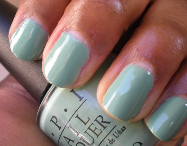
Up first is Mermaid's Tears. This was my least favorite of the 3 polishes. I would describe Mermaid's Tears as a sea foam green creme. I just don't love this pastel green color on me. I think this color would pop against pale and olive skin tones, but washes out on me:

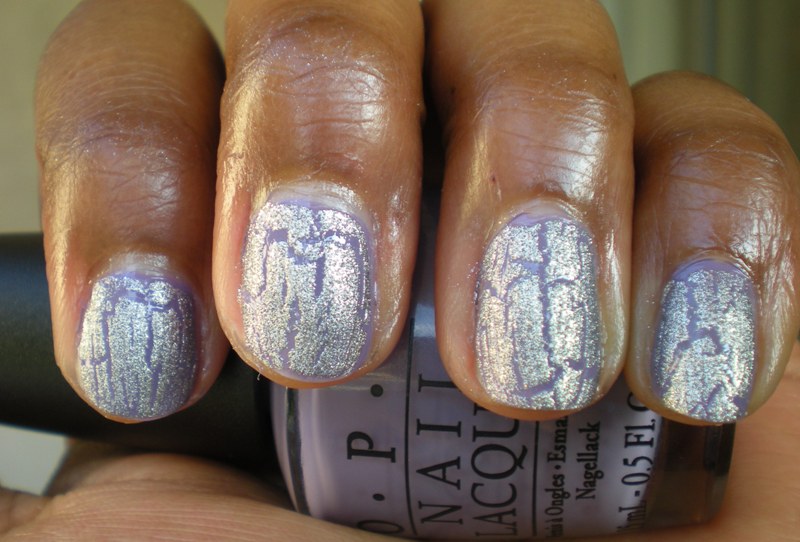
When I added the silver shatter, I definitely liked the manicure a lot more:

Up next is Planks A Lot. This is a light purple creme with blue undertones that seems to be in the middle of of the color spectrum between OPI's Do You Lilac It? (which is a very pale lilac) and Funky Dunkey, which is a darker rich purple cream. I loved this color a lot in the bottle, and expected to like it a lot on me, but when I put it on, it just didn't pop. I think that when I want this color, I'll find myself reaching instead for Funky Dunkey for that richer, deeper purple.
And again, silver shatter makes everything better:

Finally is the gem of the collection, Sparrow Me the Drama. I. Love. This. Color! SMtD is a beautiful bright pink creme that really popped against my skin tone:

And adding the silver shatter just made this color sparkle even more!

Sparrow Me the Drama is definitely the winner in my eyes from this collection, but don't be surprised if Mermaid's Tears shows up in a future manicure - I will learn to love soft pastel greens if it's the last thing I do!
What do you think? What are your favorites from the POTC Collection? Did you try any of the murky pastels I passed on? And how do you really feel about green nail polish? Sound off in the comments!
As I'm sure you know, OPI recently released its Pirates of the Caribbean collection! The collection includes 6 new colors and the amazing silver shatter. 3 colors are super pale and typically not my style - Stranger Tides, Steady as She Rose, and Skull & Glossbones. Since these colors aren't up my alley, I decided to skip on them, and instead am reviewing the 3 bolder colors from the collection - Mermaids Tears, Planks A Lot, and Sparrow Me the Drama, along with silver shatter. The formula on these was okay, only requiring 2 coats, but did look a little streaky, so not quite the buttery application we all love. Read on!
Up first is Mermaid's Tears. This was my least favorite of the 3 polishes. I would describe Mermaid's Tears as a sea foam green creme. I just don't love this pastel green color on me. I think this color would pop against pale and olive skin tones, but washes out on me:
When I added the silver shatter, I definitely liked the manicure a lot more:
Up next is Planks A Lot. This is a light purple creme with blue undertones that seems to be in the middle of of the color spectrum between OPI's Do You Lilac It? (which is a very pale lilac) and Funky Dunkey, which is a darker rich purple cream. I loved this color a lot in the bottle, and expected to like it a lot on me, but when I put it on, it just didn't pop. I think that when I want this color, I'll find myself reaching instead for Funky Dunkey for that richer, deeper purple.
And again, silver shatter makes everything better:
Finally is the gem of the collection, Sparrow Me the Drama. I. Love. This. Color! SMtD is a beautiful bright pink creme that really popped against my skin tone:
And adding the silver shatter just made this color sparkle even more!
Sparrow Me the Drama is definitely the winner in my eyes from this collection, but don't be surprised if Mermaid's Tears shows up in a future manicure - I will learn to love soft pastel greens if it's the last thing I do!
What do you think? What are your favorites from the POTC Collection? Did you try any of the murky pastels I passed on? And how do you really feel about green nail polish? Sound off in the comments!
Subscribe to:
Posts (Atom)